
Why are brands ditching plain QR codes? Because the plain black-and-white square is often the one part of a campaign that looks nothing like the brand. A picture code fixes that: the logo, product or artwork becomes the code, so the spot customers actually interact with finally looks like it belongs.
Picture a perfume launch. The poster is shot in soft light, the type is custom, the colors match the bottle. Then, in the corner, a stark grid that could have come from a parking garage. Here is why more brands are swapping it out.
What's wrong with plain QR codes?
Nothing, technically. Plain QR codes scan well, cost nothing to make and do their job. The trouble is everything around the job.
- They look the same everywhere. The same square sits on a luxury box, a utility bill and a parking meter.
- They break the design. Designers often shrink them, push them to a corner or hide them on the back, because they clash with everything else.
- They say nothing. A plain code gives no hint of who made it or what it opens.
That last point matters more than it seems. A code is a small request: "trust me, point your camera here." A plain square makes that request with no brand behind it.
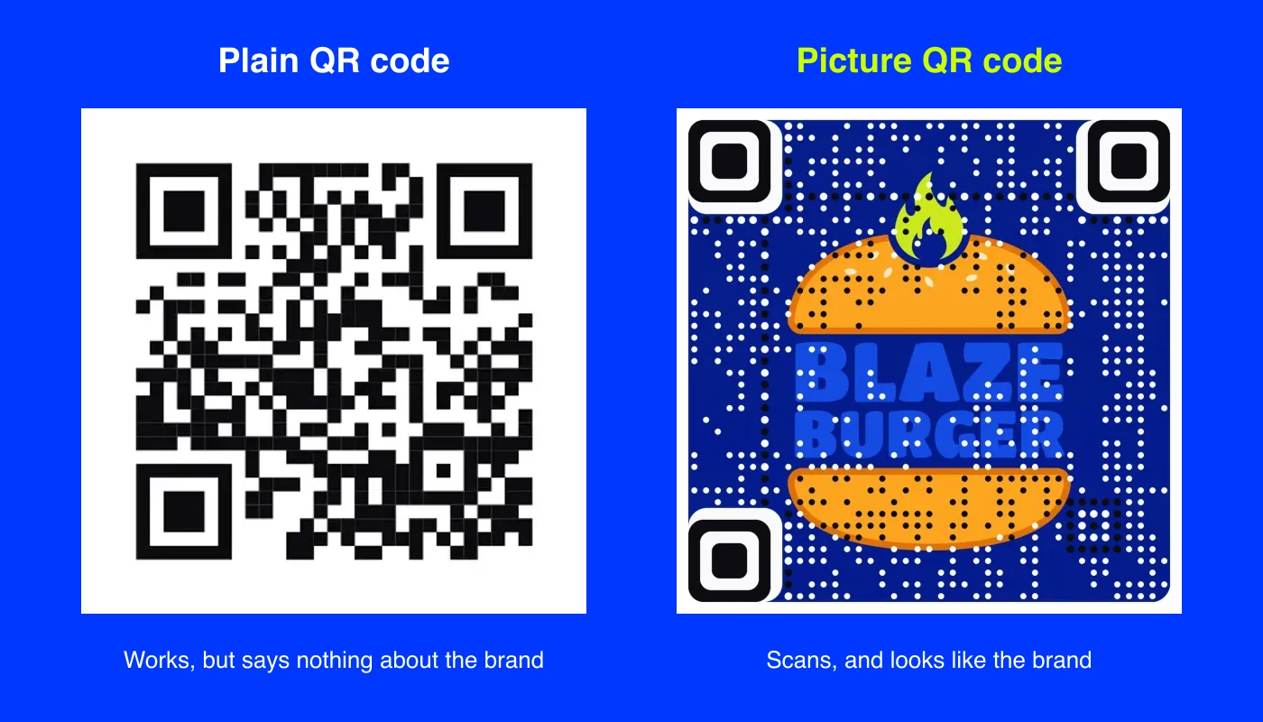
Reason 1: brand consistency
Brands spend a lot of effort making every touchpoint feel the same: packaging, signage, menus, ads, shop windows. The QR code is often the only element no one designed.
A picture code closes that gap. The code can be the logo, the product shot or the campaign artwork, so it uses the same colors, the same mood and the same imagery as the rest of the piece. On packaging, it becomes part of the label instead of a sticker on top of it. Our guide to branded QR codes for packaging shows how that works on boxes, bottles and bags.
Reason 2: attention
People have learned to look past plain QR codes, the same way they look past barcodes. A square that looks like every other square is easy to ignore.
A picture code gives people something to look at first. A painting, a face, a product or a bold logo draws the eye, and once someone is looking, scanning is one small step away. It also earns better placement: designers stop hiding the code when the code is the best-looking thing on the page.
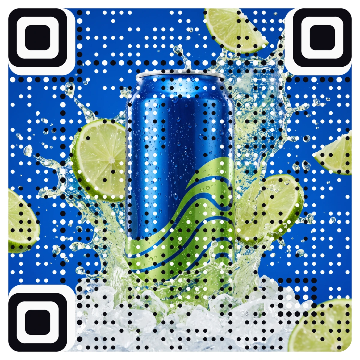
Reason 3: trust
QR code scams usually rely on plain codes. A sticker placed over a real code on a parking meter or a poster is easy to make because every plain code looks alike.
A code that clearly carries your brand is harder to fake convincingly and easier for customers to recognize. It tells them, before they scan, who the code belongs to. It does not replace good habits, like checking the address before opening it, and it works best alongside them. That is why the destination matters too: point codes at your own domain, and on AriaQR you can verify that domain so your codes show "Verified domain" on a public check page.
Reason 4: the code becomes part of the campaign
When the code is art, it can carry the creative idea instead of interrupting it.
- A fashion brand can use the season's lookbook image as the code on hang tags.
- A hotel can turn its lobby photo into the code on key card sleeves.
- A real estate agency can make the code from the listing's best exterior shot.
- An event can use its poster art as the code on wristbands and banners.
Each of these is a design decision, not a technical compromise. If you want to see what is possible, the AriaQR gallery shows real picture codes made from paintings, logos and product photos.
Do picture codes still scan?
This is the right question to ask, because some art codes do not. Images that bury the corner squares, or lose too much contrast, look good and fail at the till.
AriaQR handles it differently. Every code is verified on real decoders under real-world conditions before you download it, and the site shows a clear verdict. If you want a side-by-side view of the two approaches, regular QR vs AriaQR compares them in detail.
You also keep the practical benefits of a dynamic code: an editable destination and scan analytics. Placements let you put a different code on each poster or channel and compare them side by side, which is the honest way to see whether a picture code earns more scans for your brand.
Where to start
Pick the one place where your plain QR code looks most out of place, often packaging, a shop window or a hero poster. Make a picture code from the image that already carries that campaign, preview it, and run it next to the old code as a separate placement. Let the scans tell you which one stays.